Yahoo Internal Website
The Yahoo Creative Studios sales team needed a website to serve as a central hub for all sales collateral. A data-driven redesign was necessary to enhance efficiency, ensuring users could quickly access relevant information.
Role:
UX, UI, and visual design.
“Jules stepped up in a big way, not only helping with the design but helping lead and plan the entire effort.”
-Nicole Stappler, Principal Designer
8.4%
-9%
Increased traffic
Bounce Rate


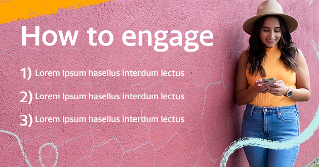
Customized geometric patterns and a duotone palette. A playful use of Yahoo’s colors without going overboard and a friendly image style to ensure relatability.
The final look and feel


Previous Design
What can I learn from what this looks like?
Featured content takes up a lot of room.
Why are the resources at the bottom?
Visual hierarchy is non-existent.
The aesthetics are out of date.

Wireframes
Data showed that users had too many choices on the old design. There were too many redundant buttons so my goal was to leverage data and figure out what resources were being clicked on the most.
Here are two different options that I presented. There are subtle differences between them as the team was figuring out what was still important so I wanted to give options for content hierarchy.


Throughout the initial design phase, I leaned into the illustration style that Yahoo brand guidelines had to offer. I created different textures through paintbrushes and used fun and dynamic imagery of people while keeping the color palette bright.