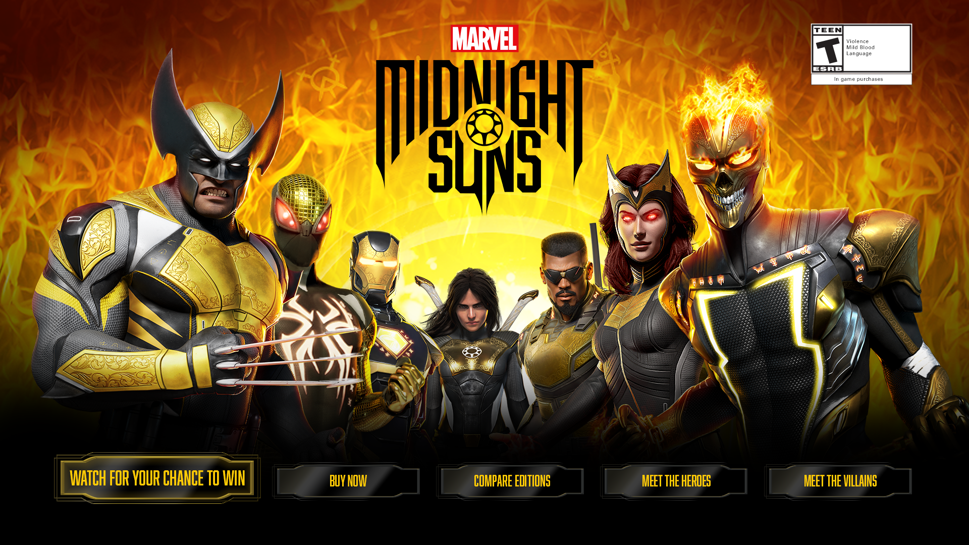
Marvel Midnight Suns
Marvel Midnight Suns is set in the darker side of the Marvel Universe and the overall tone of the artwork reflects that. Inspiration struck as I channeled my inner Captain Marvel and had a great time diving into the details of this artwork by drawing on elements to create an immersive digital experience on the Xbox advertising platform.
Team:
Xbox Advertising Services
Account Manager
Lead Designer
Developer
My role
I was the lead UI and UX designer on this project so I was responsible for creating a user journey, prototype, landing pages, and banner ads. I thought through the flow from when the user initially turns on their Xbox console to entering a sweepstakes to the actual purchase of the game. When creating options, I would listen to the client’s goals and cater my journey to their needs. This client was driving sales of their game so I included a “buy now” button on as many pages as possible.
Once the user journey was established, I would move on to each landing page's visual design. I would take the visual elements of the brand and establish a visual and content hierarchy.
Part of the challenge of this project was pushing the visual language of a very established brand and strict IP. How do I stay true to this iconic brand, but make the experience memorable and unique? My solution was to leverage the exceptional visual style and animate it.
99,226
2 minutes
Above average time spent on microsite
Total user clicks
20%
Above average video completion
Key Learnings
Know when to ask for help. I spent a lot of time trying to figure out how to make animated fire in After Effects. The tricky part was keeping the exact same effect as the key art displayed on the website. Marvel is too well known that if there is even a sense of sub par design efforts, it will be felt and it’s not a good look for anyone involved. So, that’s when you have a great conversation with your developer and see what they can do on the CSS side that will be identical to the fire effect on the Marvel Midnight Suns website. It looked so amazing and I still learned a lot about After Effects. Win win.
Let the small things go. This client pushed back on the size of ESRB rating (The legal mark that says “T, for teens” you have seen it 100 times). They were convinced that it was not the right size and we went through at least two additional rounds to accommodate their request. The thing is, ESRB has a standard size that I legally had to obtain so, the client created their ESRB that included all of the descriptors and it was bigger than the legal requirements so it was fine. I chose to use it and streamline the process so this could be launched on time.